Contents
Overview
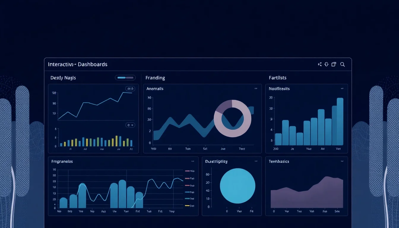
Interactive dashboards are dynamic graphical interfaces designed to present complex data in an easily digestible format, allowing users to explore, filter, and analyze information in real-time. Originating from the need to monitor critical systems at a glance, much like an automobile's dashboard, these tools have evolved significantly with advancements in computing and data science. They typically aggregate data from multiple sources, displaying key performance indicators (KPIs), trends, and outliers through charts, graphs, maps, and tables. The 'interactive' element is key, empowering users to drill down into specific data points, adjust parameters, and customize views, thereby fostering deeper understanding and enabling quicker, more informed decision-making. Companies like Tableau, Microsoft Power BI, and Qlik are major players in this space, offering platforms that democratize data analysis for businesses of all sizes.
🎵 Origins & History
The concept of a dashboard as a centralized display of critical information traces its lineage back to the instrument panels of early automobiles, providing drivers with essential metrics like speed and fuel levels at a glance. The study of interactive dashboards is deeply intertwined with data visualization principles, emphasizing clarity and efficiency in presenting information.
⚙️ How It Works
At their core, interactive dashboards function by connecting to one or more data sources – databases, spreadsheets, cloud services, APIs, etc. – and processing this raw data into meaningful visualizations. This typically involves a data ingestion and transformation layer, followed by a visualization engine. The 'interactive' aspect is powered by front-end technologies, often using JavaScript libraries like D3.js or frameworks like React, which allow users to manipulate the displayed data. Common interactive features include filtering data by date range or category, drilling down into specific segments of a chart to see underlying details, hovering over data points for tooltips, and even exporting data or visualizations. These actions trigger queries back to the data source or manipulate the already loaded data client-side, updating the visualizations dynamically without requiring a full page reload, a paradigm often facilitated by AJAX or similar asynchronous communication techniques.
📊 Key Facts & Numbers
A single dashboard can aggregate data from dozens or even hundreds of disparate sources, processing terabytes of information to present concise views.
👥 Key People & Organizations
Pioneers in the business intelligence space, such as Bill Inmon, often referred to as the 'father of data warehousing,' laid the foundational concepts for data aggregation that dashboards rely upon. More recently, companies like Tableau (founded 2003, acquired by Salesforce in 2019), Qlik (founded 1993), and Microsoft Power BI (launched 2015) have democratized dashboard creation, making sophisticated interactive tools accessible to a broader audience. Key figures in data visualization, such as Edward Tufte, have profoundly influenced the design principles behind effective dashboards, emphasizing clarity, accuracy, and the avoidance of chartjunk.
🌍 Cultural Impact & Influence
Interactive dashboards have fundamentally reshaped how businesses operate and how individuals interact with data. They've moved data analysis from the exclusive domain of IT departments and statisticians to frontline employees, fostering a data-driven culture across organizations. This democratization of insights has led to faster problem-solving, more agile strategy adjustments, and improved customer understanding. The visual nature of dashboards also makes complex information accessible to a wider audience, influencing fields beyond business, including public health monitoring (as seen in dashboards tracking COVID-19 outbreaks), urban planning, and scientific research. The proliferation of these tools has also fueled a demand for data literacy skills across the workforce, impacting educational curricula and professional development programs.
⚡ Current State & Latest Developments
The current landscape of interactive dashboards is characterized by rapid innovation in AI and machine learning integration. Tools are increasingly offering automated insights, natural language query capabilities (allowing users to ask questions in plain English, like 'show me sales by region last quarter'), and predictive analytics. Cloud-based platforms like Google Data Studio (now Looker Studio) and AWS QuickSight are gaining traction, offering scalable and cost-effective solutions. The focus is shifting towards embedded analytics, where dashboard functionalities are integrated directly into other applications and workflows, rather than existing as standalone tools. Furthermore, there's a growing emphasis on real-time data streaming and the visualization of time-series data for applications in IoT and operational monitoring.
🤔 Controversies & Debates
One significant debate revolves around the potential for dashboards to oversimplify complex realities or lead to 'analysis paralysis.' Critics argue that the curated nature of dashboards can obscure crucial context or encourage a narrow focus on easily quantifiable metrics, potentially ignoring qualitative factors or long-term strategic goals. The ease with which users can manipulate data also raises concerns about data integrity and the potential for misinterpretation if users lack sufficient data literacy. Another controversy pertains to data privacy and security, as dashboards often aggregate sensitive information, making robust access controls and anonymization techniques paramount. The push for 'self-service BI' also faces challenges in ensuring governance and maintaining data quality across an organization.
🔮 Future Outlook & Predictions
The future of interactive dashboards points towards even greater intelligence and seamless integration. Expect advancements in augmented analytics, where AI proactively identifies anomalies, suggests correlations, and even generates narrative summaries of data trends. The line between dashboards and operational applications will continue to blur, with embedded analytics becoming the norm, providing contextual insights directly within the tools employees use daily. Virtual and augmented reality (VR/AR) may also play a role, offering immersive ways to explore complex datasets. Furthermore, as edge computing grows, dashboards will increasingly process and visualize data generated directly from IoT devices and sensors in real-time, enabling immediate operational responses.
💡 Practical Applications
Interactive dashboards find application across virtually every sector. In marketing, they track campaign performance, customer acquisition costs, and ROI. In finance, they monitor stock portfolios, budget adherence, and financial forecasts. Healthcare organizations use them to track patient outcomes, hospital capacity, and disease prevalence. E-commerce businesses leverage them for sales analytics, inventory management, and customer behavior analysis. Operations teams use dashboards for supply chain visibility, production efficiency, and quality control. Even in sports, dashboards are used to analyze player performance and game strategies. The common thread is the need to distill large volumes of data into actionable intelligence for specific objectives.
Key Facts
- Category
- technology
- Type
- topic